Convert Tailwind Components to Logical Tailwind with This Tool
Convert any tailwind component to RTL ready with one click.

I love coding but if I have to spend half just fighting with the UI to get things looking as I want, then I don't feel very productive. This why I always love to find copy-past starting points from places like TailwindUI of Flowbite, to help move faster. However, almost always these components are built to work with Left-to-Right (LTR) direction. So what happens when these components are integrated into websites that need to support Right-to-Left (RTL) languages like Arabic? Often, they break.

Why does this happen?
This happens when a component use Non-logical CSS like padding-left, margin-right, top-5 and much more. Non-logical properties include width and height which can break designs for languages that are Top-To-Bottom (TTB).
However, Both Flexbox and Grid are designed logically, allowing them to function correctly irrespective of the direction. This explains why some parts of the design, such as the spacing between icons and links, display correctly in both LTR and RTL.
New CSS properties have been introduced to address these issues, creating a more logical user interface. For instance, padding-start was introduced to correspond to padding-left in RTL, while block-size was developed to match height. Many more logical CSS properties have been developed. A complete list of these properties can be found here.
Introducing to-logical -tailwind
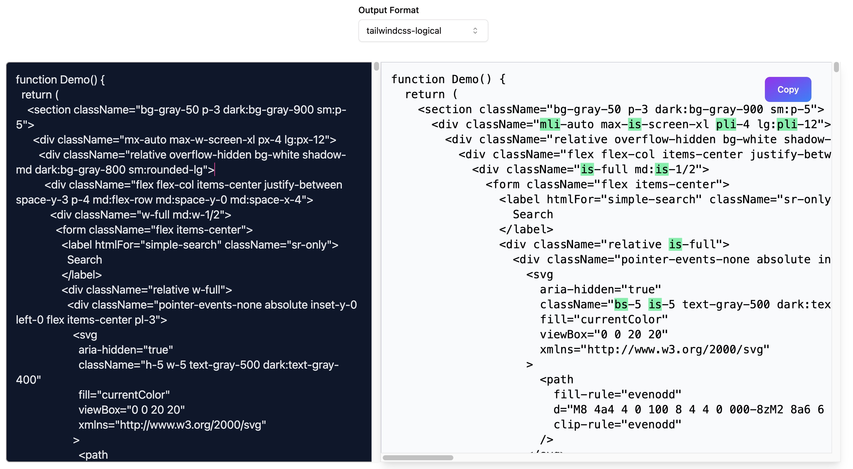
Lucky for us the TaiwlindCss ecosystem for a while had a plugin that added support to logical Css in Taiwlind. Also more recently TaiwlindCss added native support to RTL with V3.3 release. To-logical-tailwind, support both output formats and converts any tailwind component to a "logical-tailwind" component.

Conclusion
You can start using to-logical-tailwind today, and the code for the project is open-source and you can find it here. Happy hacking and feel free to open an issue if you need any help 🤓.


